Academic communication is a complex and evolving discipline that requires disseminating specialized knowledge to diverse audiences. Among the many formats used to convey this information, the academic poster has undergone significant changes over time [1, 2]. Once considered a rare and prestigious opportunity to present at major conferences, posters have now become ubiquitous, with speaking time and individual attention for each poster significantly reduced. Despite their wide use, posters often occupy a lower status in the academic communication hierarchy and are frequently deprioritized.
This shift presents new challenges for the poster format, requiring it to balance multiple functions: creating an accessible overview, guiding the reader through the content, capturing attention among a variety of competing posters, and leaving an impression on the audience.
Recent literature has responded to these challenges by proposing new layout formats to enhance the effectiveness of posters as standalone communication tools. Specifically, the #BetterPoster approach offers an alternative to more classic formats, addressing the need for posters to be more visually engaging and reader friendly [3, 4].
In collaboration with the national Danish Cancer Research Conference (Danske Kræftforskningsdage) 2024, we have systematically explored how to improve the poster session, including refining guidelines for poster format inspired by the #BetterPoster framework. Based on this, we aim to assess the extent to which this new format has been adopted and whether it enhances the audience’s experience in academic settings.
The objectives of this study are twofold: [1] to evaluate the degree to which the modified format was applied and [2] to determine whether the modified format contributed to an improved experience for both viewers and readers, and what layout ideas were effectful.
Method and Material
This is an observational study based on posters presented at the Danish Cancer Research Conference 2024, Odense, Denmark. The conference is multidisciplinary but solely focused on cancer research, approached with multiple perspectives and methodologies. The conference attendees included researchers, healthcare management, policymakers, journalists, patients, advocacy groups, and health authorities (total number of guests 534). A total of 103 posters were accepted for the conference. Poster presenters prior to the conference were strongly encouraged to follow the official guidelines for poster format, which was inspired by #BetterPoster format by Morrison et al. and was sent out as a poster guideline to the presenters (available in supplements) [3, 5]. Posters were visible for the full length of the conference (two full days). At the end of the first day of the conference, an interactive poster session was schedule with a duration of 1 h. Here, posters were orally presented on ten simultaneously poster tracks, each track moderated by two moderators to facilitate questions and discussion.
Categorization of Poster Format
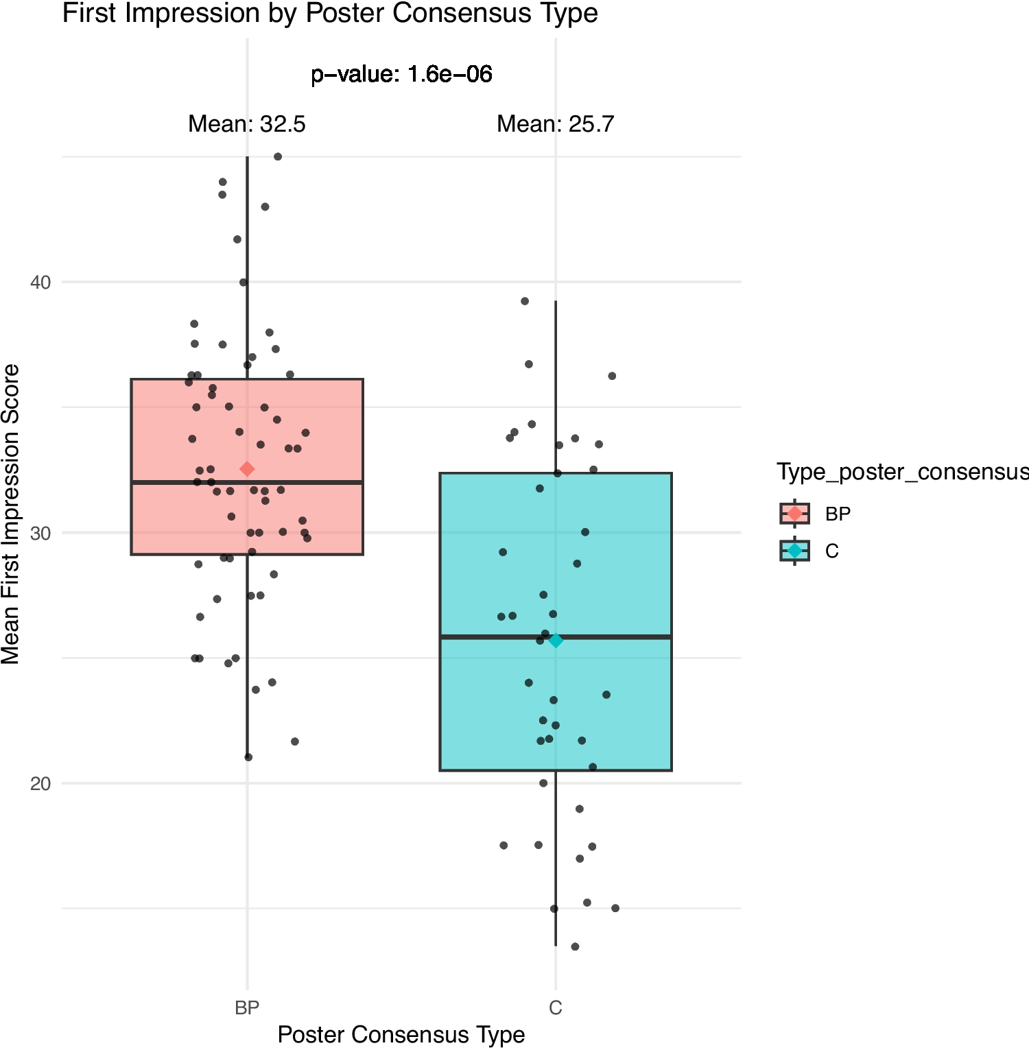
All posters were categorized based on their format as either “#BetterPoster format” in coherence with Morrisson’s format ideas (bill board conclusion/take-home message, important figures or messages centralized, format guiding the reader through the study) [3, 4] or as “classic format” following a traditional format (title at the top, IMRAD (introduction, method, results, and discussion), figures, and conclusion at the bottom of the paper) [6]. The categorization was done independently by two raters (author LB and DEØ), and if there were disagreements, the poster was reassessed together, and consensus was reached.
Items Assessed
All posters were assessed for four items: first impression (0–50 points), organization (1–4 points), poster design (1–4 points), and wordiness (1–4 points).
The four items were assessed by two to four raters per poster. Authors LB and DEØ rated all posters independently, and the moderators who moderated the poster presentations at the interactive poster session were invited to rate the posters in their track independently.
For the item “first impression,” an arbitrary scale of 0–50 points was used where 50 was the best score. It was based on the visual first impression of the poster [7, 8].
A detailed description of the scales for the items “organization,” “poster design,” and “wordiness” were defined as seen in Table 1, inspired by Khadka et al. [8]. All raters had received written information about the items and scales before the conference.
Statistical Analysis
Data analysis was performed using R (version 4.3.2). Poster scores were collected from up to four raters per poster across the four items, and variations depending on the number of raters were assessed before the statistical analysis. Interrater reliability was assessed using the non-parametric test Kendall’s W for all four item scores across all four raters [9]. The Shapiro–Wilk test and Levene’s test were used to assess the normality and homogeneity of variances for all four items, respectively. t-tests were performed to compare scores for all four items for the two poster types, and a difference was considered significant if the p-values < 0.05. If assumptions for parametric testing were not met, the non-parametric Wilcox test was used instead. Pearson correlations were calculated to explore the relation between “first impression “ and “organization,” “poster design,” or “wordiness.”


Comments (0)